 Live Site
UX Design & Web Development
Consultation, Web Development, Web Desgin, Media Prep and optimization, Accessibility
REACT
Bootstrap
Live Site
More is a recycling services and waste management organization dedicated to delivering top-tier waste management solutions. The company's mission is to foster a greener future by implementing innovative recycling programs and efficient waste collection services. More collaborates with various industries to promote sustainability, turning waste into valuable resources through tailored recycling initiatives and educational workshops.
The previous website faced several challenges such as having an issue with information overload; the homepage contained too much text, making it difficult for users to quickly find relevant information, had poor visual hierarchy where information was not easily distinguishable and the site lacked mobile responsiveness, which negatively impacted the user experience for those accessing the site from mobile devices.
A comprehensive user research phase was conducted. User interviews were carried out to gain insights into the needs and pain points of existing users. A competitor analysis was performed to identify best practices and areas where More’s website could improve. Additionally, a heuristic evaluation of the current website was conducted to pinpoint major usability issues based on established usability principles. The key findings from this research revealed that users desired quick access to information about services and the company’s impact, that visual elements were crucial for engaging users, and that simplifying navigation and layout was essential for a better user experience.
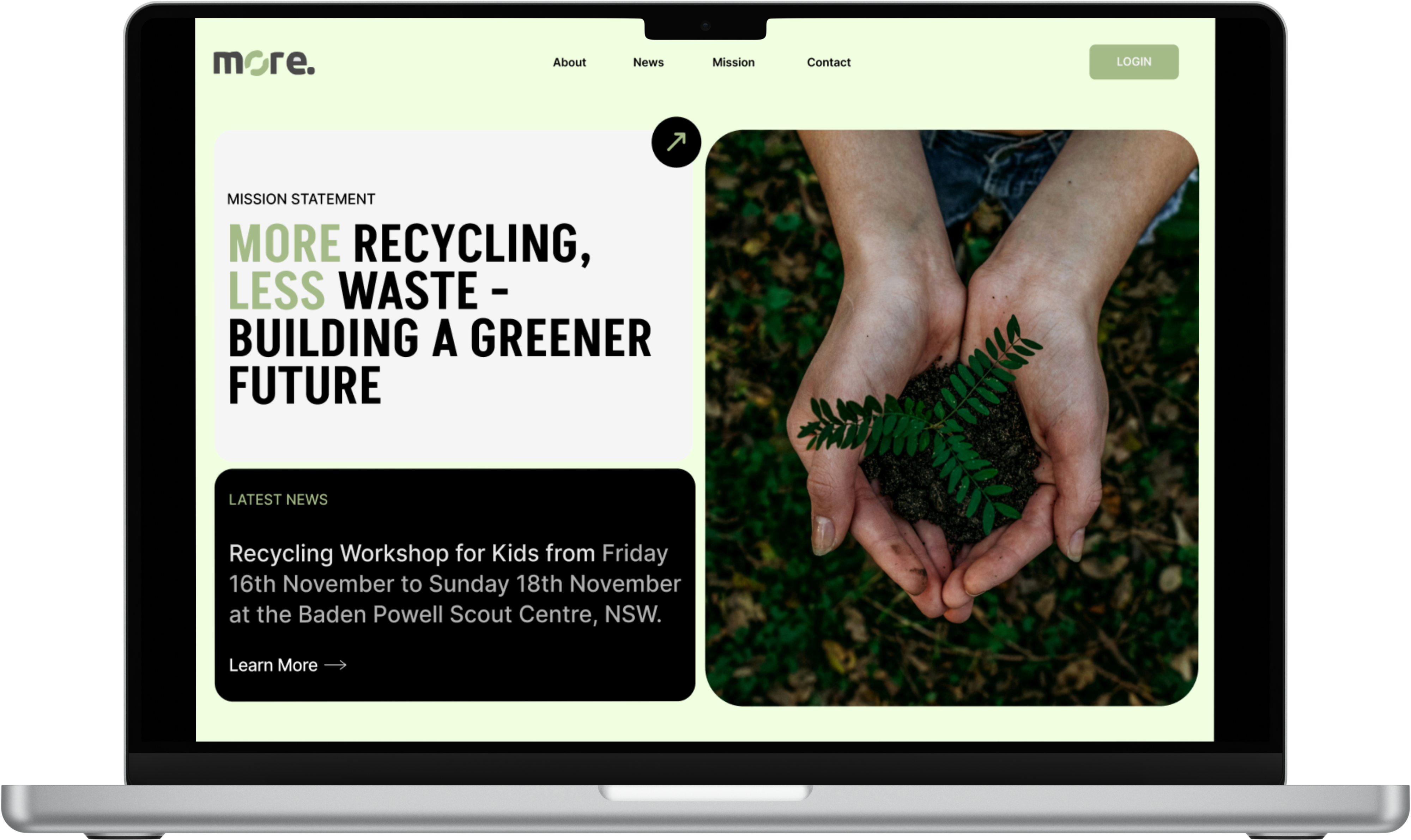
The design process began with restructuring the website's information architecture to create a simplified and intuitive layout. The content was organized into clear sections: Hero section with a grid layout showcasing their latest workshop and services, About, Projects, News, and Contact. The homepage was prioritized to highlight key information such as the services offered and the company’s impact. Low-fidelity wireframes were initially created to establish the basic layout and structure. These wireframes were then developed into high-fidelity prototypes using design tools like Figma, incorporating feedback from stakeholders throughout the process.
The homepage was redesigned with a compelling hero section that included a strong mission statement and relevant imagery to capture user interest. Service cards were clearly defined with icons, titles, and brief descriptions to quickly communicate the offerings. The projects undertaken by the company were highlighted with images and descriptions to build credibility. Key impact metrics were displayed to showcase the company’s achievements and build user trust. To address the poor visual hierarchy, the redesign incorporated a clear and consistent hierarchy of headings, subheadings, and body text. Important information was highlighted using larger fonts, bold text, and strategic use of color to draw attention. The website was also made fully responsive to provide an optimal experience on both desktop and mobile devices.